iOS 26 Liquid Glass Design Changes: Beta 2 vs. Beta 3 Visual Deep Dive
With each iOS beta release, Apple makes subtle, but sometimes significant, changes to design elements, and iOS 26 Liquid Glass design in Beta 3 is no exception. The latest update has quietly stirred discussion among Apple fans for one major visual shift: the behavior of navigation bars and overlays across native apps. The change? Apple is dialing down the translucency and turning up the opacity, giving the “Liquid Glass” design a more frosted, matte feel in Beta 3.
If you’re curious what changed between iOS 26 Beta 2 and Beta 3, this guide breaks it down app by app, with contextual commentary and what these tweaks might mean for future iOS design trends.
Table of Contents
What Changed in iOS 26 Beta 3?
Across native Apple apps, navigation bars,especially at the bottom,have become more opaque. The once nearly transparent “Liquid Glass” panels now have a frosted look that mutes background colors. This design tweak aims to improve readability and consistency, but some users say it reduces the depth and polish that gave iOS its iconic fluidity.
1. Apple Music
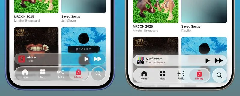
Before (Beta 2): The navigation bar at the bottom was light and see-through, allowing vibrant album art to glow beneath it.
After (Beta 3): Now, the nav bar uses a solid frosted glass effect. While still semi-translucent, it blocks more color from showing through, creating a flatter UI.
2. Safari
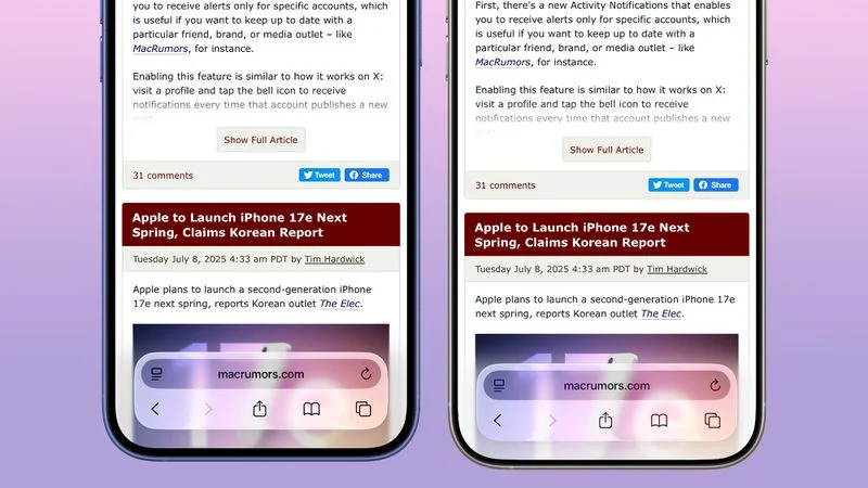
Changes in Safari are more dynamic, varying based on website colors and the tab view in use.
- URL bar is less reactive to background content
- Opaqueness improves consistency when scrolling
- Frosted glass style mimics that of Apple Music
3. App Store
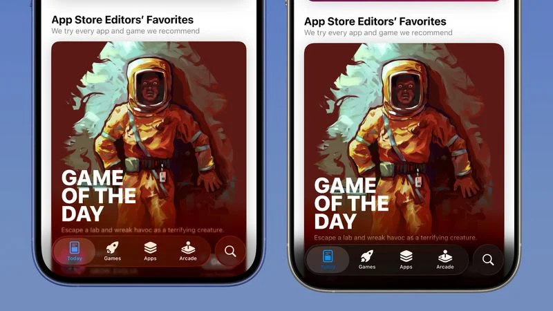
Beta 2: Navigation elements blended into the background, especially on scrolling pages with promotional art.
Beta 3: Nav bars are now distinctly layered over content, increasing legibility but reducing the immersive feel.
4. Podcasts
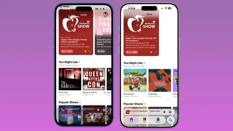
Like Apple Music, the Podcast app’s lower nav bar is now clearly separated from background artwork.
- Background color bleed-through has been almost entirely removed
- Provides higher contrast for text and icons
5. Apple TV
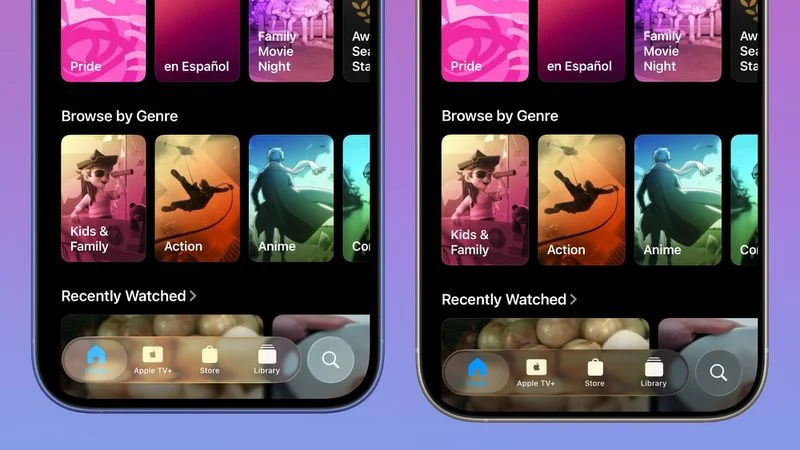
The Apple TV app’s shift is more subtle:
- The background itself is darker
- Navigation glass is darker but transparency is mostly preserved
6. Photos
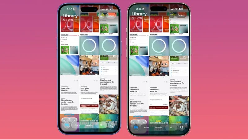
Photos sees minor updates:
- Top navigation bar is slightly darker
- Transparency remains close to Beta 2
- Minor improvements for text contrast in albums view
7. Calendar
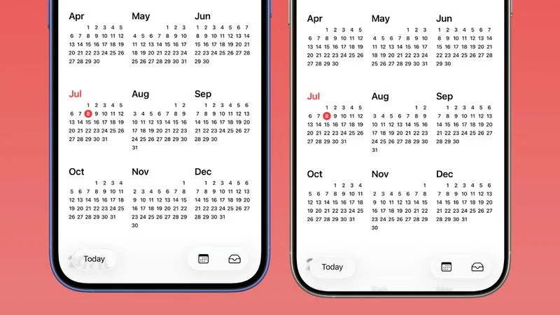
Navigation bar and buttons in Calendar are now:
- More opaque in both Light and Dark Mode
- Better contrast for accessibility
- Less bleeding of background events through header
8. Spotlight Keyboard & Search
Search sees mixed transparency adjustments:
- Keyboard is slightly more transparent
- Search bar area is noticeably darker, making suggestions more legible
9. Dark Mode vs. Light Mode Transparency
Interestingly, Dark Mode retains more transparency. This might be due to improved white text readability on darker surfaces.
- Light Mode: Heavy frosted overlays in most apps
- Dark Mode: Only slightly darker menu elements
10. Color Context & Background Behavior
Liquid Glass behavior now reacts more subtly to background hues:
- On light backgrounds: Frosted effect is harder to distinguish
- On colorful or dynamic wallpapers: Change is more obvious
11. Lock Screen, Notifications & Control Center
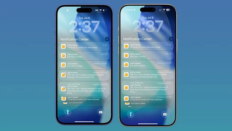
- Lock Screen: Clock is marginally more opaque
- Notifications: Slightly darker background layers on some colors
- Control Center & Home Screen: No significant change reported
Final Thoughts: Where Apple’s Design Language Might Be Headed
iOS 26’s navigation UI changes suggest Apple is shifting away from ultra-transparency to favor visual clarity, especially for accessibility and consistent design under varied lighting conditions. While the shift may disappoint some Liquid Glass loyalists, others may welcome the improved contrast and reduced visual clutter.
Expect to see more of this frosted layering,and potentially fewer fully transparent UI elements,in future beta iterations as Apple fine-tunes the user experience.
Stay tuned as we cover future betas leading up to the iOS 26 official release this fall.

